Painho
Pera Rocha
(Pear Rocha)
(Pear Rocha)
Internship
This is Pacifica 2013
This is Pacifica 2013
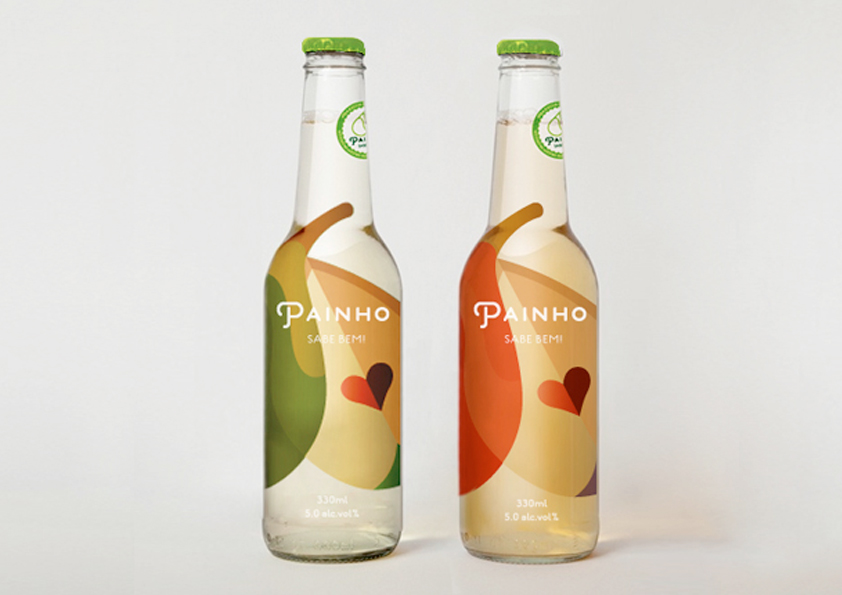
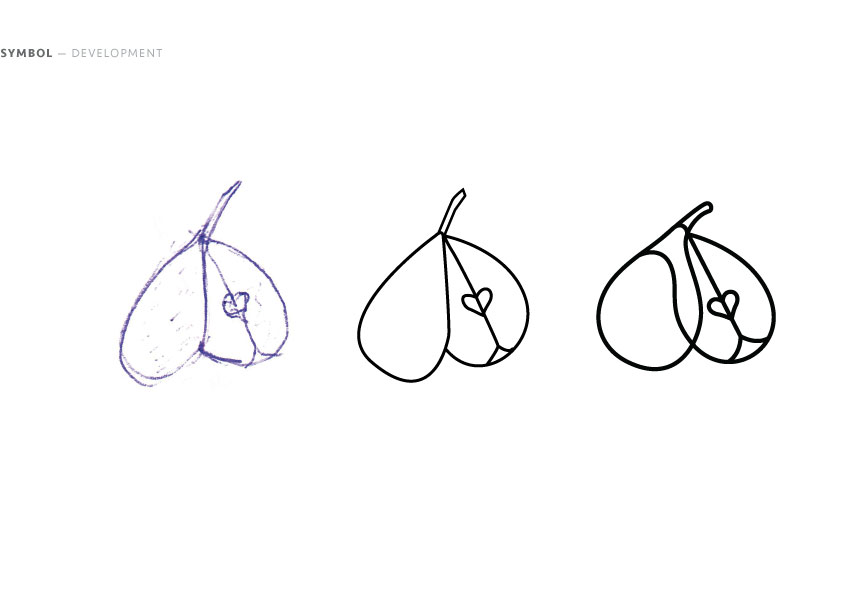
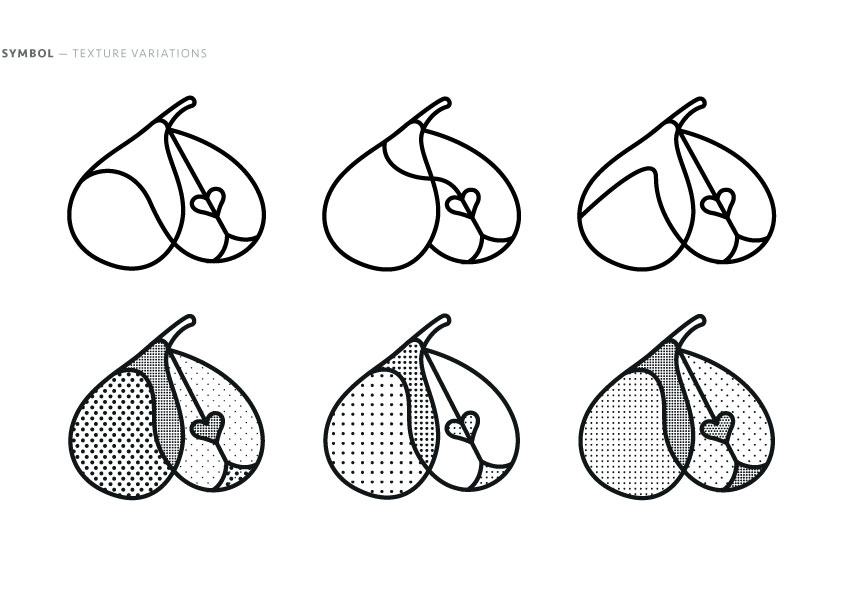
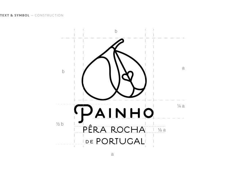
Design of a symbol for a redesign proposal for the brand Painho, a distributor of the Portuguese pear variety Rocha, done during the Erasmus internship at the design studio This is Pacifica. The Rocha pear is produced exclusively in Portugal and has a cult-like status for Portuguese people. Her main characteristics: the colour, varying from light green to dark yellow with brown spots, a brown russet and a white and grainy texture.
The symbol explores the relationship of the exterior and interior of the fruit. The connection of lines creates a visible metaphor between the appearance and taste of the pear. The heart is an often used shape in traditional Portuguese patterns and builds the core and the vital part of the pear.
DRM: Concept; llustration; Branding; Logotype